How to Protect Yourself After the Yahoo Attack

How to Protect Yourself After the Yahoo Attack by The New York Times.  Available from <http://www.nytimes.com/interactive/2016/technology/personaltech/what-to-do-if-hacked.html?_r=1> [UPDATED September 23, 2016]

Yahoo said on Thursday that hackers in 2014 stole the account information of at least 500 million users, including names, email addresses, telephone numbers, birth dates, passwords and, in some cases, security questions.

Even if you might not have used a Yahoo account for years, security experts say the incident could have far-reaching consequences for users beyond Yahoo’s services.

Here are some answers to frequently asked questions about how you can protect yourself.

How do I know if my personal information was stolen?

Assume it was.

Yahoo said it had begun notifying potentially affected users, but its breach was huge, and similar attacks and smallerthefts happen all the time.

Should I change my password?

The first step, as always, is to change passwords for sites that contain sensitive information like financial, health or credit card data. Do not use the same password across multiple sites.

Changing Yahoo passwords will be just the start for many of you. Comb through other services — especially those for which you provided a Yahoo email address to create an account — to make sure passwords used on those sites aren’t too similar to what you were using on Yahoo.

And if they weren’t doing so already, they’ll have to treat everything they receive online with an abundance of suspicion, in case hackers are trying to trick them out of even more information.

How do I create stronger passwords?

Try a password manager like 1Password or LastPass.
These sites create a unique password for each website you visit and store them in a database protected by a master password that you create. Password managers reduce the risk of reused passwords or those that are easy to decode.

If you must create your own passwords, try creating long, complex passwords consisting of nonsensical phrases or one-sentence summaries of strange life events and add numbers and special characters.

Examples:

  • My favorite number is Green4782#
  • The cat ate the CoTTon candy 224%
  • Or, if you’re extra paranoid, consider mimicking this setup:

Jeremiah Grossman, a web security expert, memorizes only a few passwords, including one to unlock his computer, and another to unlock an encrypted USB drive containing a file with a list of all his passwords for dozens of services. None of his passwords are memorable because they are random.

“I select them quite literally by banging on the keyboard a few times like a monkey,” Mr. Grossman said, adding that his setup is “a bit more paranoid” than that of the average person.

Create the strongest passwords for the sites that contain the most sensitive information and do not reuse them anywhere.
Are passwords enough?
Passwords are not enough. If a site offers additional security features, like secondary or two-factor authentication, enable them. Then, when you enter your password, you will receive a message (usually a text) with a one-time code that you must enter before you can log in.

Many bank sites and major sites like Google and Apple offer two-factor authentication. In some cases, the second authentication is required only if you are logging in from a new computer.

How can I stop my information from being stolen in the first place?

Increasingly, you cannot. Regularly monitoring your financial records can help minimize the damage if someone gets your information. But only the companies storing your personal data are responsible for securing it. Consumers can slow down hackers and identity thieves, but corporate computer security and law enforcement are the biggest deterrents.

What if you have changed your password after the breach happened but before it was disclosed?

The Yahoo attack happened two years ago but was disclosed only this week. Even if you changed your passwords recently for other websites, chances are at least some of them are similar to the password linked to your Yahoo account two years ago.

To play it safe, you should change your passwords, starting with your most sensitive accounts, including your online banking account.

Forget about security questions

Sites will often use security questions like “What was the name of your first school?” or “What is your mother’s maiden name?” to recover a user’s account if the password is forgotten.

These questions are problematic because the internet has made public record searches a snap and the answers are usually easy to guess.

In a recent study, security researchers at Google found that with a single guess, an attacker would have a 19.7 percent chance of duplicating an English-speaking user’s answer to the question, “What is your favorite food?” (It was pizza.)

With 10 tries, an attacker would have a 39 percent chance of guessing a Korean-speaking user’s answer to the question, “What is your city of birth?” and a 43 percent chance of guessing the favorite food.

Jonathan Zdziarski, a computer forensics expert, said he often answered these questions with an alternate password. If a site offers only multiple choice answers, or requires only short passwords, he will not use it.

“You can tell a lot about the security of a site just by looking at the questions they’ll ask you,” he said.

Photo:  By Yahoo! Inc. [Public domain], via Wikimedia Commons

How to Protect Yourself After the Yahoo Attack by The New York Times.  Available from <http://www.nytimes.com/interactive/2016/technology/personaltech/what-to-do-if-hacked.html?_r=1> [UPDATED September 23, 2016]

5 Email Pre-header Tips that Boost Open Rates

5 Email Pre-header Tips that Boost Open Rates by Carolyn Nye.  Available from <http://www.practicalecommerce.com/articles/127407-5-Email-Pre-header-Tips-that-Boost-Open-Rates>. [September 20, 2016]

The sender name and subject line are primary drivers of email open rates. Almost as important — if not more important — is the pre-header, the text that appears just below the subject line in the inbox of most mobile and desktop email clients.

In this post, I’ll offer five pre-header tips, to encourage your recipients to open your emails.

1. Avoid Repeated Words

There is no need to repeat the “From” text in either the subject line or the pre-header. And there’s also no need to repeat subject line text in the pre-header.

dodge
This sender — Chrysler Dodge Jeep Ram Seattle — repeats its name in the subject line (in blue), wasting space that could be used for something meaningful.

This may seem obvious. However, I frequently receive emails that have repeated content in the subject line, the “From” line, and the pre-header text. Recipients see your company or brand name in the From line. There is no reason to repeat that in the subject line or in the pre-header. In addition, many senders simply repeat their subject line or a variation of the subject line in the pre-header. Again, that is redundant and a waste of valuable real estate.

La-Z-Boy has many repeated words in the subject lines (in blue) and pre-headers.

The example above, from La-Z-Boy, has two errors. First, there are repeated words from the subject line to the pre-header. In the first email, La-Z-Boy the word “Super” is used four times, “Savings” two times, and “Saturday” two times. It’s too much to read and comprehend when presented so close together.

In the other email example, La-Z-Boy repeats the exact first two words — “You’re Invited” — of the subject line again in the pre-header, thus wasting the opportunity to tell subscribers something different that may prompt them to open the message.

The second error from the La-Z-Boy examples is using a “View in web browser’ link.” These links were used as best practices years ago for email clients that did not render content well. Few, if any, people need or click on these links now, in 2016.

If a sender believes it should keep the “View in web browser” link, the sender should move the link down so it does not display in the inbox preview, as the recipient cannot do anything with that information until after she opens the email. It’s best to use that space to tell the recipient something new that will entice her to actually open the email.

2. Pre-headers Are Extensions of Subject Lines

Writing subject lines is difficult. The objective is to get recipients interested so they will open the email. Fortunately, pre-headers help with this. As an extension of the subject line, pre-headers allow senders to convey more information, including an entirely different topic or promotional copy, to really encourage opens. This is how Discovery Senior Living uses its pre-headers, as shown below.

This pre-header — “Discover. Connect. Experience. Get your free guide to…” — extends from the subject line and raises the curiosity of the recipient, which can increase opens.

In the example above, the pre-header — “Discover. Connect. Experience. Get your free guide to…” — nicely extends the subject line. The sentence breaks at a point — “Get your free guide to…’ — that prompts a reader’s curiosity, causing him to open. Having pre-headers purposely end at a point that requires the recipient to open for the additional information is a good way to increase opens.

3. Supplement Product Offers and Sales

If your company’s emails typically feature offers or sales, consider using pre-headers to showcase content. Pre-headers can have more characters than the subject line, which provides the opportunity to feature content in a compelling way.

Both examples below are from clothing retailers. Both use the pre-header to offer fashion tips, instead of pushing a sale.

The RealReal and LOFT, two clothing retailers, use the pre-header to offer fashion tips, instead of pushing a sale. For The RealReal, it’s “What to Wear & What to Do in London.” For LOFT, it’s “Fall dressing doesn’t get any simpler.”

4. Try Capitalized Letters

Using all caps in a subject line can hurt deliverability. All caps can flag an email, increase its spam score, and cause the message to be filtered into a bulk or junk folder. However, using all caps or partial caps in a pre-header can be effective, especially since pre-headers display directly below the subject lines on smartphones.

In the example below, Ticketmaster uses a mostly-caps pre-header to emphasize the live event — “NOTHING BEATS BEING THERE!” — for the concert it is promoting.

Using all caps in a subject line is a bad idea. But caps in a pre-header can be effective, as shown in this example from Ticketmaster — “NOTHING BEATS BEING THERE!.”

5. Use the Pre-header Real Estate

Perhaps you have not used pre-headers, or are unsure of crafting a clever one. Regardless, always take advantage of the pre-header real estate.

The example below show two emails from car dealerships. One used a pre-header (“Carolyn, The wait is finally over!”). The other did not.

The screenshot below is from my desktop inbox. Note the whitespace that is blank under the subject line from Rush Chevrolet. In the Phillips Chrysler email, the pre-header is an extension of the subject line. Moreover, Phillips Chrysler personalized the pre-header to include my name, which is even more effective.

The Rush Chevrolet email does not include a pre-header, which results in unnecessary whitespace. In the Phillips Chrysler email, the pre-header is an extension of the subject line. It’s also personalized, which is even more effective.
5 Email Pre-header Tips that Boost Open Rates by Carolyn Nye.  Available from <http://www.practicalecommerce.com/articles/127407-5-Email-Pre-header-Tips-that-Boost-Open-Rates>. [September 20, 2016]

How to test a website before you launch: a 28 point checklist

How to test a website before you launch: a 28 point checklist Author .  Available from <https://www.clickz.com/how-to-test-a-website-before-you-launch-a-28-point-checklist/106011/> [Sept 20, 2016]

Three years ago, Mark Knowles wrote a thoroughchecklist for testing a website prior to its live launch. It was a very helpful guide, so we thought we’d update it for the current digital landscape.

Here we present a guide on how to test a website, full of updated information and tips to make sure everything looks and works exactly as it should on launch day. Everyone has a role here, and that’s how the tasks have been divided – for Editors, Designers, Developers, SEOs and Network Administrators.

Please note: many of the tips below are from Mark Knowles, but have been updated to reflect any changes.

For the Editor and Writers…

1. Spelling, grammar, punctuation

Check for proper spelling, typos, and grammar site-wide. Not just in article text and headlines, but also throughout the navigation, calls-to-action, buttons, forms etc.

2. Forms

Fill out the forms on the site and go through the following questions:

  • Can the flow be improved?
  • Do you get stuck?
  • Are the instructions accurate?
  • Does the completed form get sent to the right people or person?

3. Check images

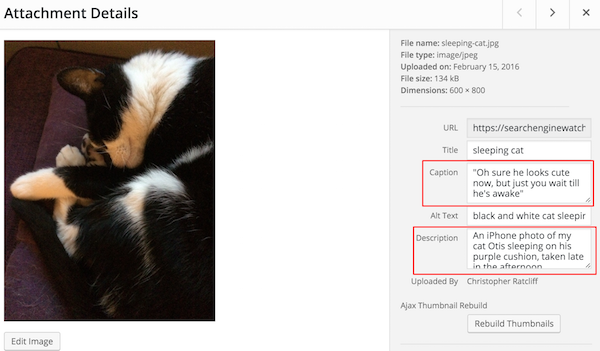
Make sure your images are all optimised for the web. Ensuring they’re not too large – and site-speed draining. As well as being properly labelled with titles and alt-text.

wordpress-photo-upload-highlighting-caption-and-description

4. Context

When giving a critical eye to the pages within the site, ask:

  • Why would I visit this page?
  • Is the content ready for visitor?
  • Does the page address the audience?

For the Web Designer

5. Site speed

Check the size of your page sizes and their load time. You can use Google’s own site speed testto do this. Site speed is a ranking factor, so follow any improvements Google recommends as closely as you can.

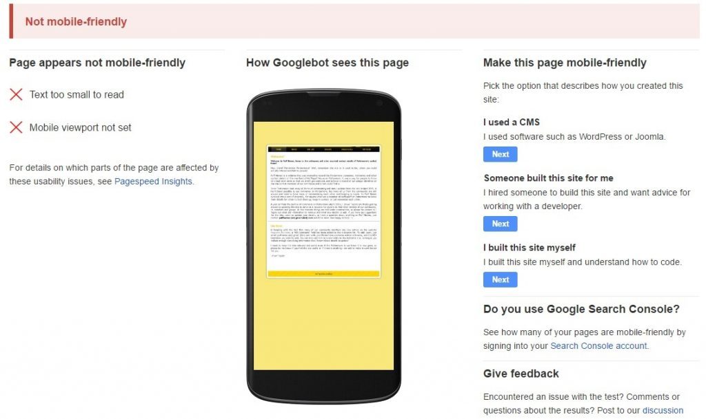
6. Mobile friendliness

Is your website mobile-friendly. Frankly it’s very difficult not to building a multi-device compatible website in 2016, but just in case, here’s a handy checklist to ensure your website’s mobile-friendliness.

mobile-friendly-copy-1024x609

7. Compatibility

Check to make sure your website’s pages render well in common browsers. Browser share is a moving target so to help prioritize efforts, here’s a site that continually examines it.

8. Fonts

Sometimes font codes get dropped into a page inadvertently and make a letter or a word look funny. Check to see that the formatting is consistent, and look for odd blips in the copy.

9. Navigation

Test the navigation to breaking point. Make sure every single possible journey through your website leads to wherever its meant to without any broken links or wrong pages.

Makes sure your on-site search works, and it delivers accurate results, and if there are any zero-results that you’re providing navigation to other relevant pages.

For the Web Developer

10. Live URLs

Often, sites are built at a URL (uniform resource locator) that isn’t the website’s final destination. When a site goes live, the URLs are transferred from a staging area to production. All the URLs change at this time, and they need to be tested.

On small sites without any tools, you can navigate to each page to make sure they all work. On a site with fewer than 500 URLs, you can use Screaming Frog SEO Spider Tool for free to find bad URLs. For larger sites, there is a modest annual fee.

11. Sign up to Google Search Console

Google Search Console (previously Webmaster Tools) is an invaluable tool for all webmasters. This is where Google will communicate with you should anything go wrong (crawling errors, manual penalties, increase in 404 pages, malware detected, etc.)

Search Console is also where you can monitor your site’s performance, identify issues, submit content for crawling, remove content you don’t want indexed, view the search queries that brought visitors to your site, monitor backlinks.

You should also sign up to Bing Webmaster Tools.

12. Minify

This is a technique that combines and compresses website code into smaller chunks to speed up your site. You can read more about it at Google. Then, look at the website pre-launch to see if the site is using minify where it can.

13. 404 pages

When a 404 (“page not found”) error occurs, make sure you have a custom page to help your visitor find something else of use, even if it wasn’t what they were looking for. Do you have an HTML sitemap there? Does the 404 page include a site search?

14. Favicon

Favicons are those little iconic images that show up in the address bar and tabs of your browser. How does it help? It’s a small branding opportunity that lends credibility to your site. It’s nice to have one when you launch.

For the SEO team

15. 301 Redirects

Sometimes content is repurposed or gets moved to fit the new navigation structure of a site. If you have an existing site and you are changing the URL structure with your new site, you’ll want to make sure you’ve mapped the old URLs to the new ones.

The Screaming Frog spider mentioned earlier can be run on both the old site and the new. An Excel spreadsheet is a great way to document this effort. Column A has the old URL, and you place the new URL in Column B. Each row represents a redirect from old to new. On launch day, it’s time to execute.

16. Title Tags/Meta Data

This may sound like old news to some, but this easy-to-fix mistake happens every day. Make sure every page has a title tag, and make sure they are unique.

Also make sure each has a meta description. Although these snippets used in search aren’t necessarily a ranking signal, they will help a searcher decide whether to click-through or not.

17. XML Sitemaps/HTML Sitemap

Make sure your new website has an accurate site map in both XML and HTML format. You canupload your sitemap to Search Console, however most CMSs such as WordPress will automatically build a sitemap for you.

18. Analytics

Make sure Google Analytics or the analytics package you’re using, is set up and ready to go from day one so you can measure and analyse traffic to your site.

19. Structured markup

If you’re using Schema markup or any other structured data, is it rendering correctly in SERPs? You can check any errors and how to fix them in the structured markup section of Search Console.

20. Accelerated Mobile Pages

If you’re using Google’s AMP project to provide mobile searchers with faster loading web pages, you need to make sure these are rendering properly. Here’s a guide to implementing Google AMP on your website.

21. Social media integration

Do the social media icons on the site go to the correct pages? Do you have the right buttons and social plugins installed for what you are trying to accomplish and what you want the user to be able to do? (For example, does it ‘share a post’ rather than ‘Like’ your page on Facebook.)

22. SERP Display

Are the search engines displaying your pages correctly in the search engine results pages? Did you write proper meta descriptions, but they aren’t being used? Thoroughly investigate your visibility in Search Console.

23. PPC Setup

Make sure if you’re running any PPC campaigns that they’re set up and ready to go with the site launch. To avoid a lapse in service, if you have a Google PPC rep, you can set and pause all your campaigns to the new URLs prior to launch, and instead of the ads getting disapproved, your rep can approve them manually.

For the Network Administrator

24. Monitoring

A site monitor checks pages regularly to make sure it is available for visitors. Basic monitors check if the page is working.

Important pages within the site should have enhanced monitors that test if a completed form behaves the way it should. Enhanced monitors are more expensive to setup and keep running so the page in question needs to justify the additional expense.

25. Backup System

Have you thought about what happens if the server goes down? Make sure the backup system is configured properly, and the recovery process has been tested so you know it works.

26. Traffic Loads

Think about what might happen to your site if it gets an influx of heavy traffic. There are load test software tools that allow you to simulate heavy loads. If you are expecting big crowds, this is a must.

27. Protected Pages

Does your site have pages that require user credentials to view? If so, do the credentials work? From the opposite angle, also check to see that the pages can’t be viewed without proper credentials. Make several attempts to get to those URLs without proper credentials to make sure the security is working as expected.

28. Secure Certificate

If your site is ecommerce, or you’re using encrypted pages to protect visitor privacy on a form or elsewhere, you’ll want to check your certificate on launch day.

To do this, go to the encrypted section of your site. When the lock appears in the address bar, right click on it and read the message your visitors will read. It should have your name on it and state that it’s valid. If the lock doesn’t appear or the name isn’t right, let your provider know.

How to test a website before you launch: a 28 point checklist Author .  Available from <https://www.clickz.com/how-to-test-a-website-before-you-launch-a-28-point-checklist/106011/> [Sept 20, 2016]

Top 3 Digital Marketing Tips to Earn More Traffic to Your Website

Top 3 Digital Marketing Tips to Earn More Traffic to Your Website by William Morrow.  Availabe from <http://www.huffingtonpost.com/william-morrow/top-3-digital-marketing-t_b_12075358.html> [09/20/2016 04:58 pm ET]

We’ve all heard the statistics and reports on how search engine optimization (SEO) is a critical focus point for businesses on the internet. Setting a perfect stage for customers to come in and patronize your business in the form of a great website design is not just enough to make your business successful. You need several customer attraction points that can deliver not only the right quantity of referrals to your business but will also direct targeted, ready-to-buy customers to your business.

Social media may take the lead in website traffic referral for business on the internet, but what is undeniable is that search is still the leading source of the most targeted customers on the internet.

While this fact is known to most digital marketers, many are unable to recommend the right steps needed to attract qualified leads to their clients’ businesses.

This article will explore methods your business can use to make better gains through the search engine and improve sales.

Get on Google My Business

With Google’s increasing advancement in listing businesses along relevant search results, digital marketers and business owners are seeing better opportunities to get listed and be showcased directly to their customers.

Google My Business offers businesses with a brick-and-mortar presence the ability to get their business’ opening hour, phone number and location displayed to customers in search results and on Google Maps.

What’s more impressive is the “view office” feature that allows potential customers to take a virtual tour of your office without leaving Google or their seat. This will offer businesses several benefits which include increased trust and confidence in customers that have taken the virtual tour.

Use the instructions on Google My Business by Google to get started on setting your business up for the listing.

Encourage User Review

A lot of reports have shown that users who read reviews on your website, whetherthe customer reviews are negative or positive, will be highly likely to consider making a purchase from your website. Even leading digital marketing experts agree that using customer reviews on your website can enhance trust and transparency in your business.

According to Marc Smith from Top 10 Digital Agencies, “The best performing businesses have customers leave reviews on their websites so that potential buyers understand that they are dealing with trusted entities.”

There are several ways to encourage your customers to leave a review on your website. Being creative and open about the process will make them feel more comfortable to share their experience doing business with you and thus encourage others to come aboard.

Take Advantage of Off-Page Optimization

Off-page SEO is an important aspect of search optimization that businesses can take advantage of and get increased presence on top search results. While most businesses concentrate most of their resources on on-page efforts, signals like links, citations, and references on other websites are very credible ranking signals that Google considers.

In a comprehensive list that tries to share most of Google’s ranking factors, Brian Dean places the off-page optimizations efforts among the signals that Google’s algorithm considers when ranking a website.

Search engines have always been a very important aspect of digital marketing. This makes it critical for businesses to get search engine optimization right.

Top 3 Digital Marketing Tips to Earn More Traffic to Your Website by William Morrow.  Availabe from <http://www.huffingtonpost.com/william-morrow/top-3-digital-marketing-t_b_12075358.html> [09/20/2016 04:58 pm ET]

Top 5 E-Commerce Trends Of 2016

Top 5 E-Commerce Trends Of 2016 BY Amy Watson.  Available from <http://www.businesscomputingworld.co.uk/the-top-5-e-commerce-trends-of-2016/> [20/09/2016]

Ready to take on the world of e-commerce? If your answer is “not just yet”, here are some reasons why this year is the best time to pursue your online business dreams. 2016 is a great time to start working on the e-commerce dream you’ve had with the help of social media, different lending preferences, crowd funding, and the advancement of technology.

There are a lot of new trends in store for any passionate e-commerce startup with a great vision for an e-commerce business idea. This article will get you inspired by discussing the current situation and trends of e-commerce today perfect for any e-commerce startup like you for the year 2016.

But First, What Is E-Commerce?

E-commerce utilises an electronic network or the internet as a platform for buying and selling of goods and services. Usually, transactions under the e-commerce platform are B2B or business-to-business, B2C or business-to-consumer, C2C or consumer-to-consumer, and C2B or consumer-to-business. An e-commerce business usually makes use of various applications like email, online catalogues or shopping carts, social media, and the like.

Customers find e-commerce advantageous given its convenience, round-the-clock availability, speedy process, and the wide range of choices on goods and services available at the tip of their fingers. But the major downsides toeE-commerce in the perspective of a customer are that there is only a limited customer service, a long wait time, and the absence of concrete inspection of the product you wish to purchase.

Why Should You Start An E-Commerce Business?

Mobile and internet use have expanded globally making e-commerce advance radically over the years. With this fact comes the immense opportunity for storefronts to develop their significance and expand their market by finding their place online. The idea of starting an e-commerce business can cross any person’s mind considering the ease of access.

The only problem now is how to come up with a unique e-commerce business idea that can spark the interest of customers. It is common knowledge that an entrepreneur needs to carry out an in-depth research before going into any business. Before you wrack your brain for a distinct business niche to sell, it would be best if you check out the success stories of e-commerce pioneers.

Here are the top five e-commerce innovative ideas and trend from this year from the top dogs to inspire you in jumpstarting your e-commerce business venture.

1. Web To Print Business

Web to Print or web2print SaaS (software as a service) is where people can take advantage of the internet to customise/improve their desired products before being finalised by the seller company to print the designs along with producing the products. Products can range from brochures, catalogues, business cards, postcards, flyers, and other branding propaganda and even those that involve wide-format printing like banners. A good web-to-print software is used to realise all this. Here, the software may enable the customer to customise the “look” of a certain product, submit it to company for finalisation, then more possible needed coordination before the products are produced, that are all done seamlessly using the software, such as those from (http://buzz.newsjs.com/news/what-web-to-print-can-do-for-printers-just-get-the-answer-here) where customers can connect with their different requirements that they might just need for their projects.

2. Subscription E-Commerce

Here’s a good idea to spice up everybody’s month in the year: do subscription e-commerce! Imagine this: you send your customers a monthly (or it depends how often) box of treats by subscribing to your service! If you’re into organic food products, customers can get a monthly basket of organic goodies depending on the ingredients on season. If you’re into fashion, you can send them a box of trendy pieces depending on what’s hot at the moment like how Stitch Fix and Trunk Club do it. There’s no limit to your creativity and the systems you can employ to make it perfect! From your daily dose of coffee, your kid’s and pet’s playthings and even your personal hygiene products can come in a box every month. You can add it as a feature of your business, or you can base your service entirely to just that! (http://ecommerce-platforms.com/ecommerce-resources/the-hottest-ecommerce-subscription-businesses-right-now)

3. Online Grocery Store Via Apps

Nobody likes to find themselves waiting for hours at an overcrowded grocery store just to get their supplies. Sometimes you even have to haggle for your shopper’s discounts. With the advent of online food ordering apps, you can now skip preparing a shopping list, asking a shopkeeper which aisle it’s found and worrying about whether you’ve brought enough cash with you. This e-commerce idea delves into this common inconvenience. An online grocery app allows customers to choose grocery or food items, the method of delivery and even the mode of payment. (http://www.fooddive.com/news/7-grocery-retail-technologies-to-innovate-the-shopping-experience/399553/)

4. Hotel Room Booking Via Apps

One of the inconveniences a person has to experience when it comes to going on vacations is the hassle of booking a hotel. You still have to worry whether it’s at a close proximity to your venue, fully booked, clean, and other things. With hotel mobile apps taking an innovative approach into hospitality marketing, hotels can provide a seamless reservation process, using push notifications or in-app messaging to provide personalised service and to relay valuable information to their guests about their stay. There are also curated guides in the apps containing leisure activities, restaurants, transportation tips and location maps that guests can use. Like how The Bulgari Hotel in London utilises their curated mobile booking app as a guide with information ranging from nightlife, shopping, and galleries for the Bulgari traveller. (http://blog.apps-builder.com/hotels-with-mobile-apps/)

5. Product Curation E-Commerce

Modern shoppers are drawn to the convenience of e-commerce simply because they value their time more than anything. At the same time, customers are faced with choice overload while needing some expert purchasing advice. This e-commerce practice had brands exploring on personalising the shopping experience – which led to the trend of curated shopping. Curated e-commerce aims to assist shoppers on finding out products based on their own unique tastes and preferences. Websites and online apps like ShoeDazzle, JustFab, and MYHABIT let their customers take a quick online quiz to specify their style preferences, physical profile and available budget. The agony of choice is quite real, and anything that will help alleviate the overload will be much appreciated. (http://www.guided-selling.org/curated-shopping-how-it-works-and-how-successful-it-is/)

This year, many e-commerce trailblazers established even more unique ideas for the already abundant industry. This is also an exciting time to be in the e-commerce industry seeing as how everyone strives to innovate. But innovation isn’t all about the investment; creativity is what makes all the good difference. What’s great with the online platform is that it doesn’t necessarily require big capital but rather outside-the-box thinking. You will have an edge if you can see possibilities where others can’t. Prepare yourself to create new ideas as 2016 reveals many attractive and rare assortments in the e-commerce realm.

Top 5 E-Commerce Trends Of 2016 BY Amy Watson.  Available from <http://www.businesscomputingworld.co.uk/the-top-5-e-commerce-trends-of-2016/> [20/09/2016]