3 Tips for Increasing Mobile Commerce Sales

3 Tips for Increasing Mobile Commerce Sales by Taz Lake.  Available from <http://multichannelmerchant.com/ecommerce/3-tips-for-increasing-mobile-commerce-sales-21112016/> [Nov 21, 2016 3:54 PM]

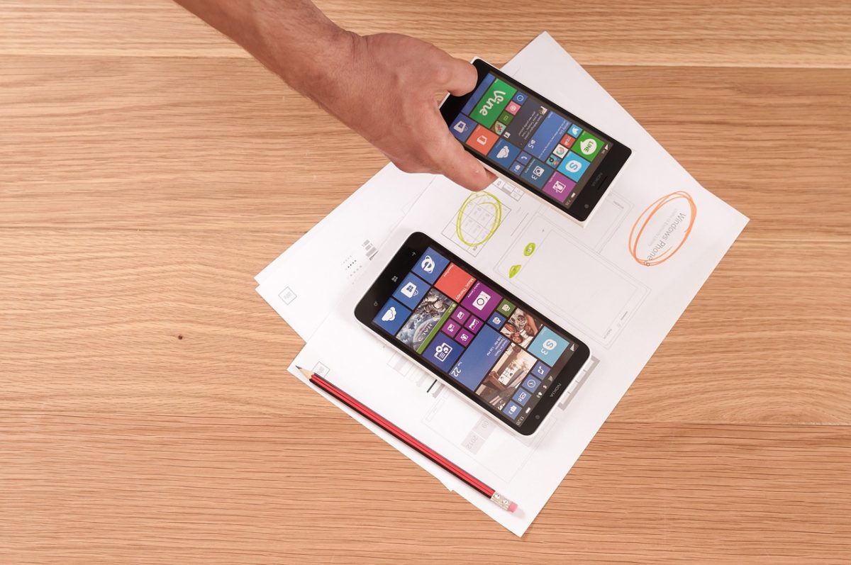
With the continued growth of the handheld device market, mobile commerce continues its rapid rise. Many millennials use their smartphones as their primary internet connection, and mobile internet traffic actually surpassed desktop traffic in 2015. This increase is traffic has also led to a rapid increase in mobile sales. A recent BI Intelligence report states that mobile commerce will represent a $79 billion market in 2016, and will make up 45% of all ecommerce by 2020.

The mobile market is clearly growing by leaps and bounds. With over half of all internet traffic coming from mobile devices, what are some of the tips for maximizing mobile commerce opportunities? As someone who has evaluated thousands of websites, I would like to share the following trends and advice:

Mobile Apps Are Not Always Necessary

Many retailers feel that they always need a mobile app to maximize mobile sales. That simply is not true. Today’s mobile devices and browsers have advanced to the point where they can handle most of the functions of the top mobile applications. For example, with the right equipment, location information can now be captured through a browser.  A mobile app is only needed if the incremental spend is justified by a business case.

The key is to treat your website like a product with mobile as a feature. You should dedicate programming resources to it and update it frequently to continually improve commerce opportunities. It is also very important to review your website periodically for errors and bugs. These would ideally be caught before production, but website owners often focus on adding new functionality to their sites, but never clean them up. Websites can easily get bloated this way.

Size Matters

Mobile connections are typically not as fast as wired desktop connections. Therefore, if a website becomes very large and there is no alternative mobile version, you run the risk of losing mobile traffic. It’s great to have a feature-rich desktop version of the site, but it is important to turn some of these features off on the mobile site.  You don’t want to block or delay customers from the main call to action which is to buy your products.

For example, I recently read an article on how Nordstrom added some advanced 3D virtual reality features to their website. Shoppers could use this technology to create 3D models of dresses and preview them in a virtual environment. This feature was a great from a functional perspective, but it was so complex it slowed the site down to the point where it was actually impacting conversions and had to be taken down.

Navigation Is Key

Navigation is one of the biggest challenges in mobile website design because there are so many different products and so little room to properly display them. Navigation control and design is one of the main reasons many of the largest retailers develop mobile apps.

When you build a website, there are ways to enable and disable features on mobile devices based on what’s called a “user agent”.  This technology can tell what type of device and browser you are using, and then the web application tunes certain site features to make the user experience more appealing.

For example, let’s say your desktop website has a fairly complex “megamenu” – a menu that presents sub-menus when the user rolls over specific words or icons.  This feature is not going to work on a mobile device. If you have this feature, you will need to ensure an alternative mobile navigation gets people to where they need to go while still preserving some level of interactivity.

Also, many retail websites provide cross-selling opportunities on certain product pages. This works well on a desktop browser, but screen real estate is limited on mobile devices. Let people focus on each product and give them the ability to add to cart easily if they choose.  Your customers will appreciate not having to scroll through all of this extra information, as well as the faster, uncluttered mobile experience.

Whether this is their first foray into ecommerce or they are considering a retail website redesign, most small and mid-sized retailers should build their websites with mobile first in mind. Mobile technology is the present and the future of e-commerce. More and more consumers are choosing to do their online shopping away from their desks, and the mobile commerce market will doubtlessly continue its rapid growth. Building a feature-rich, yet lean mobile commerce experience is a wonderful starting point for a desktop website.

3 Tips for Increasing Mobile Commerce Sales by Taz Lake.  Available from <http://multichannelmerchant.com/ecommerce/3-tips-for-increasing-mobile-commerce-sales-21112016/> [Nov 21, 2016 3:54 PM]
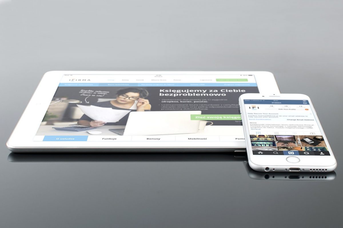
3 Mobile Friendly Website Design Tips You Should Avoid

3 Mobile Friendly Website Design Tips You Should Avoid by Zaid Ammari.  Available from <http://www.business2community.com/web-design/3-mobile-friendly-website-design-tips-avoid-01709938> [November 18, 2016]

By now, everyone understand the importance of having a mobile-friendly website. More people are using mobile devices to access to Internet each passing day. As a result, these users can account for anywhere from 20 to 50 percent of a site’s total visitors. With that said, making the transition into these sites is challenging. Business owners are designing with general advice that actually hurts their site’s performance. Here are three common design tips you need to avoid.

1. Converting Desktop Websites into a Mobile-Friendly Version As Is

Too many business owners think that all they have to do is convert their regular desktop site into a mobile-friendly one. While this seems like a logical decision, they are forgetting that this doesn’t translate well. You have to adapt to the devices that are being used and focus on serving to the user’s needs rather than trying to maintain a certain standard.

Mobile-based users spend less time and have a lower attention span than desktop users. The devices they are using often have smaller screens and are being used while they are on the go. So when the users are presented with a content heavy and graphic heavy website, they become overwhelmed and will more likely than not, abandon the website.

You also need to remember that the Internet connection on these devices is far slower than desktop devices. Users understand this intuitively and are looking for a quick solution that loads quickly. You need to design your site to provide what these users want to see and present them with a focused navigation path to help them find what they need. You also need to make the content more concise and focus on conversions rather than entertaining or educating the user.

2. Designing the Mobile Version of Your Site Based on Your Desktop Site’s Analytics

While there is a lot of advice given about using your analytics to adapt your design, not enough people are telling you to dig deeper into the performance on mobile-devices. You’ll quickly learn that how people behave on your desktop will be drastically different from how people behave using these devices.

That’s why making design and structural changes based on the analytics data for your desktop is a bad choice. You need to collect data on mobile-only users and use that exact data to adapt the design and structure. Don’t forget that users are browsing the Internet in a completely different way when using devices. They’re using their thumbs and pointer fingers to browse, sliding their fingers to scroll, and pressing down parts of their screen.

3. Setting Up a Separate Mobile-Dedicated Site

One of the worst advice that marketing firms have made in the past is pushing their clients to set up a mobile-dedicated site that is separate from desktop site. This meaning that both sites will have different URLs. There are numerous downsides of implementing this strategy.

First of all, you may face search engine penalties for duplicate content. If you want to avoid this, you will have to go back to rewrite your archived content or produce two pieces of content every time you want to put up something new for your site.

Second, if you’re planning on getting traffic from the search engines, you’ll have to double your efforts since the search engines will see both sites as two separate entities. You’ll have to build separate links, have separate Google Authorship accounts, and have separate content. This is a lot of work to undertake.

Third, promoting your brand and taking part in any kind of offline advertising for your business site will become a headache. You want to get the brand value out of your advertising, but having two distinct websites will make it confusing for your target audience. The bottom line is that it’s a better idea to use responsive or adaptive web design.

Switching over to a mobile-friendly site is no easy task. Part of creating a site that works for both audiences means avoiding critical mistakes that hurts the user’s browsing experience and making it easier for you to promote your site.

3 Mobile Friendly Website Design Tips You Should Avoid by Zaid Ammari.  Available from <http://www.business2community.com/web-design/3-mobile-friendly-website-design-tips-avoid-01709938> [November 18, 2016]

Useful Tips To Help You Become a Web Designer

Useful Tips To Help You Become a Web Designer by David Meyer.  Available from <http://tech.co/useful-tips-help-become-web-designer-2016-10> [October 23, 2016]

e to technology like Photoshop, jQuery and other related proficiencies, web designers’ skills have become a major concern nowadays. Becoming a leader in web designing arena is not a piece of cake for everybody: The process demands a hands-on grip on every step of the web design. The website designer is familiar with all the newest market trends and strives to bring innovation while developing more productive solution.

Helping people is our primary aim. Thus, this post holds all the useful tips that can help you become a successful web designer, if you manage to master all of them. Let’s proceed with the handy website designer tips:

What You Need To Know

Photoshop

As the most demanded option for the designers, Photoshop has been utilized for many years now. Many expert front-end developers being acquainted with this software program know thoroughly that how to play with it to extract the utmost graphics from the number of PSD files. The execution of different tasks with Photoshop has become simpler and the credit goes to all 3rd party plugins who made it possible.

Start Designing With HTML/CSS Code

The designers acquainted with HTML & CSS code try to initiate designing process in the browser and this is all they do bypassing their Photoshop process. HTML design is needed for the coding. Before you tackle all that, you should know HTML & CSS basics.

CSS Frameworks

Some prominent frameworks like Foundation, Bootstrap, and other related frameworks can help you to attain expected results exact to the imaginations. These credible sources come up with numerous friendly features and advanced programs required to form the applications. Their presence in the web designing realm has proved to be the useful choice for the web designers especially when it comes to constructing applications.

Right Color Utilization

Never go with the copied color scheme which other designers have already used. A lot of research over the web is necessary to build the appreciable color schemes, so take some time and choose the best option to fulfill your project needs.

Go With Responsive

The responsive design or layout is also referred to as media queries, flexible images, and fluid grid. Hence, you must be aware of all these terms and what they actually represent to ensure the decision you have taken is actually right or not. Ultimately, responsive design offers a remarkable compatibility with almost all smart devices, their supported browsers, and platforms without losing the real existence of images or text. This is a needed approach these days to get more and more traffic, so avoiding it may take you closer to the risk.

Promoting Yourself Is Also Imperative

Now, the question is how to promote your business and which mediums will help you easily execute these tasks. We are here to help you know the right ways via this post, wherein we are going to explain a few indispensable yet effective things beneficial to promote yourself globally:

Add Portfolio

Adding this section to the website is exemplary in order to display the successfully accomplished work done in the past or recently. It’s good to show your proficiency across the world. If you haven’t dealt any great work in the past, then also you should continue thinking about it to insure that you are ready for all project handling needs, simple or complex.

Get Ready for Social Media

Social networking sites have a broad network these days. Hence, these are the perfect ways for the seekers to find relevant jobs exact to the expected demands. Regardless of social media platform, it’s better to confirm that the created profile over there is summarized, clean, and attention-grabbing so that viewer can easily impress and contact you soon.

Include Your Potential Clients

Almost all interested clients ask your previously achievements and work that you have successfully delivered. So, prepare a list of your reliable clients and add them to your site so that the new users can understand what kind of work you have completed in your past journey.

Conclusion

In the cutthroat digital world, technology is ever-evolving. Hence, any web designer should be familiar with all the latest changes and strive to learn new ones in order to remain ahead of the pack.

Useful Tips To Help You Become a Web Designer by David Meyer.  Available from <http://tech.co/useful-tips-help-become-web-designer-2016-10> [October 23, 2016]